NYCEDC —
Website redesign and brand refresh for New York City Economic Development Corporation.
About The Project
New York City Economic Development Corporation is a non-profit corporation dedicated to creating a dynamic, equitable, and sustainable urban economy. NYCEDC new website furthers its mission by focusing on registration of vendors and relevant businesses, distribution of RFPs and collection of proposal, promotion of available jobs and intake of candidates, promotions of projects, assets, initiatives, programs, services, and incentives, as well as direct and indirect contact with key audience (vendors & businesses, entrepreneurs & investors, public, and press.)
Role
Product/Visual
Agency/Year
CodeandTheory/2019
Team
Design Lead: Ricky Blake
UX Designer: Viviana Flores
Product Manager: Zach Gad
Experience Strategist: Julie Xie
QA: Jeneveve Salvador
Technical Director: Abhi Gupta
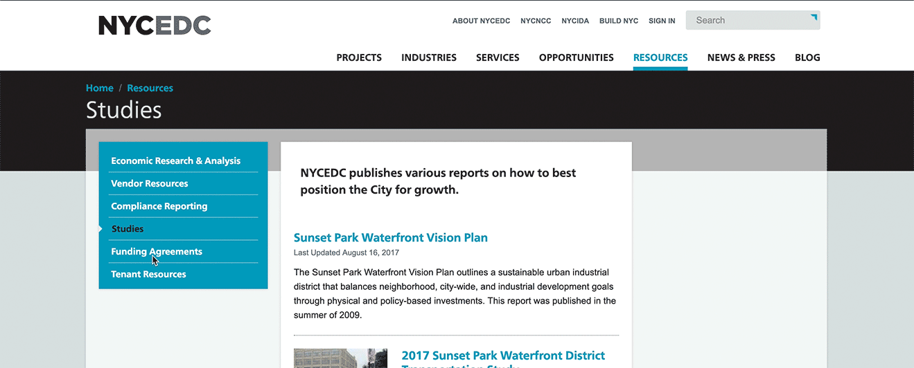
The Current Site and Its Problems
There are so many problems existing on the current NYCEDC site.
- Template inconsistencies: Inconsistent use and placement of tools for pathing/storytelling/resources
- Updating: There is an overwhelming amount of info that is duplicative and not hierarchical.
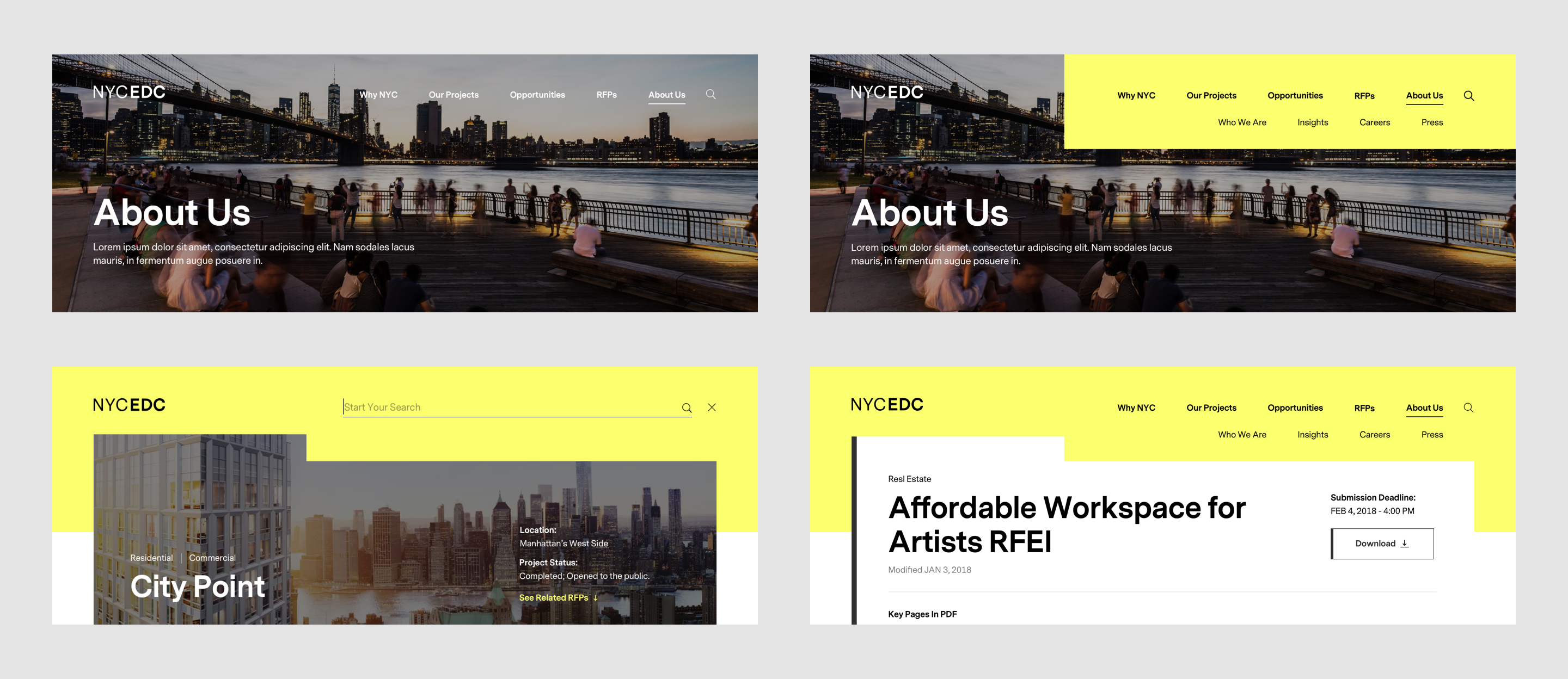
- Navigation: Navigation is inconsistent and unclear relationships between details pages and their parents. Breadcrumb navigation and Subnav are irreflective of user's place on-site and movement across the website. They are not communicative, not orienting, or grounding. Subnav impedes wayfinding.
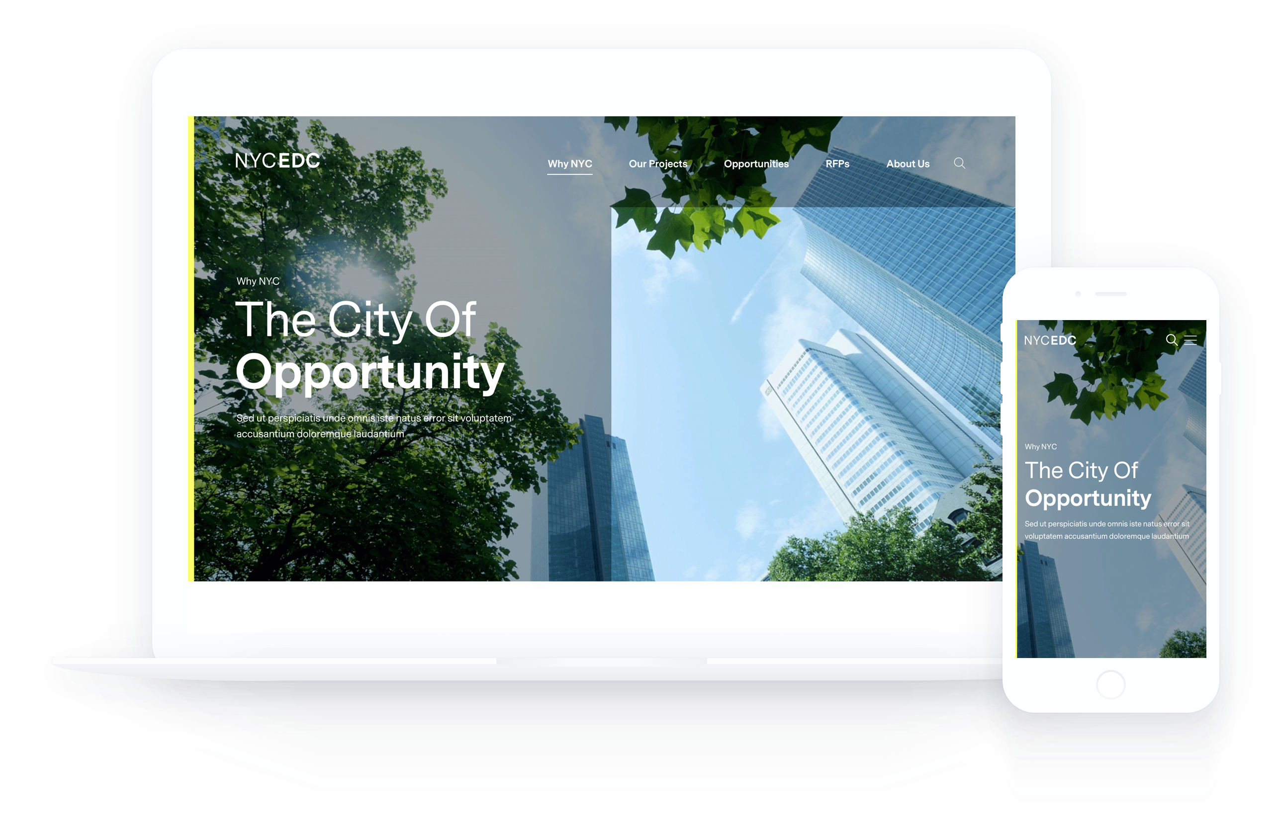
- Lack of Compelling Visual: Imagery, typography, layout, and UI elements are outdated. Animations are not interesting enough to keep users excited and reinforce the overall interface.
Shown below is screengrab of the previous navigation. Breadcrumb navigation and Subnav both are irreflective of user's place on site.
Another example of subnav not reflecting correct subnav sections.
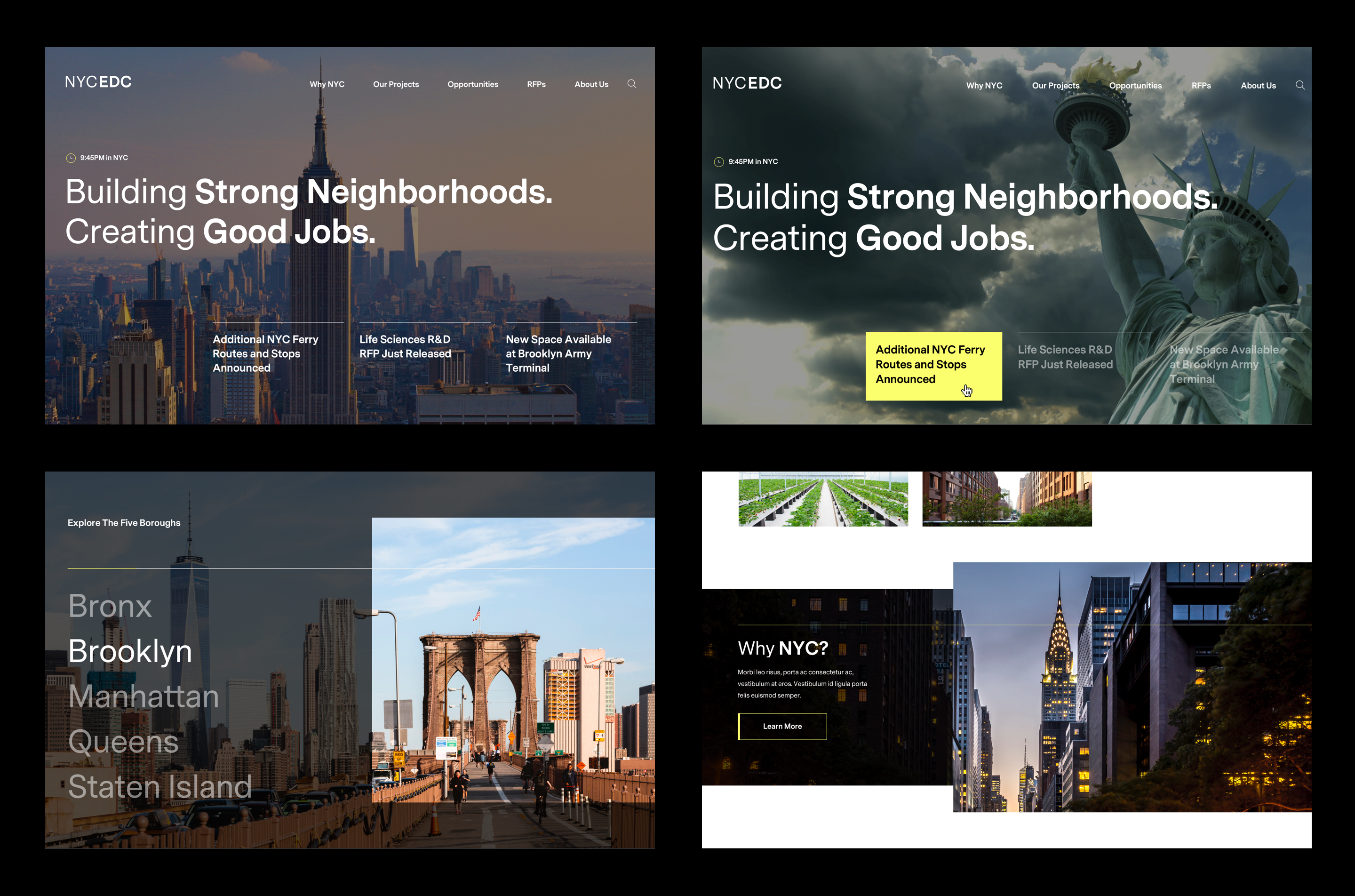
The Overall Solutions
The client wants their users to self-select, and for that to happen, information architecture and tagging structure have to be clear and correct. Context should be provided quickly to understand language. Storytelling, compelling visual, and hierarchy in typography also need to be incorporated.
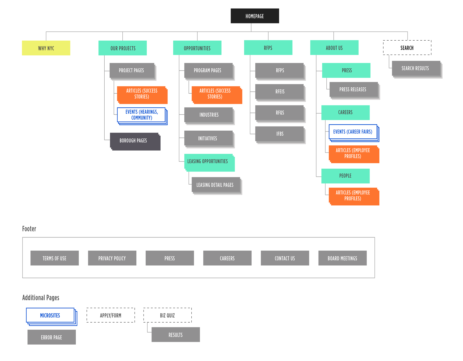
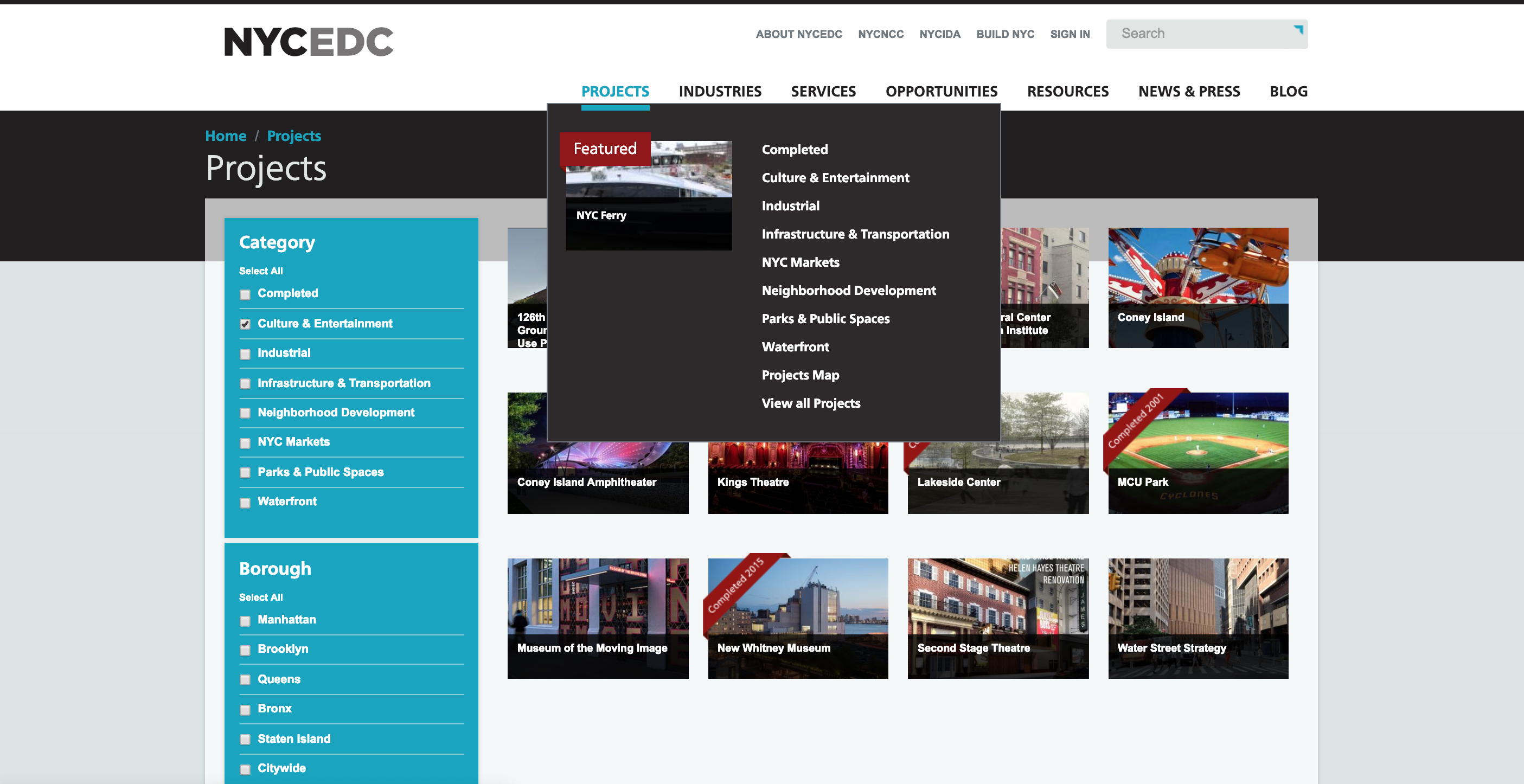
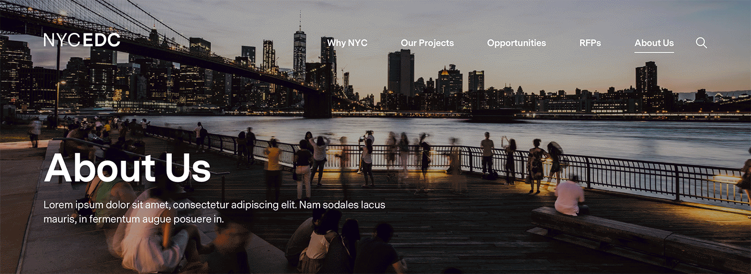
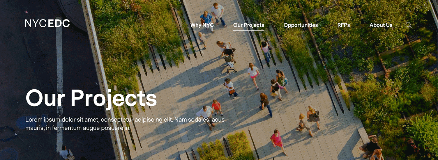
Navigation
Navigation is made simpler both for user usability and information hierarchy.
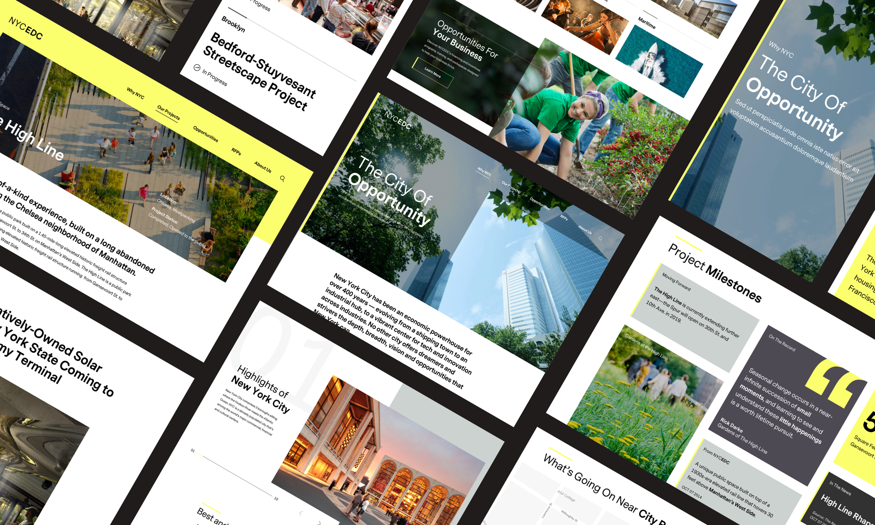
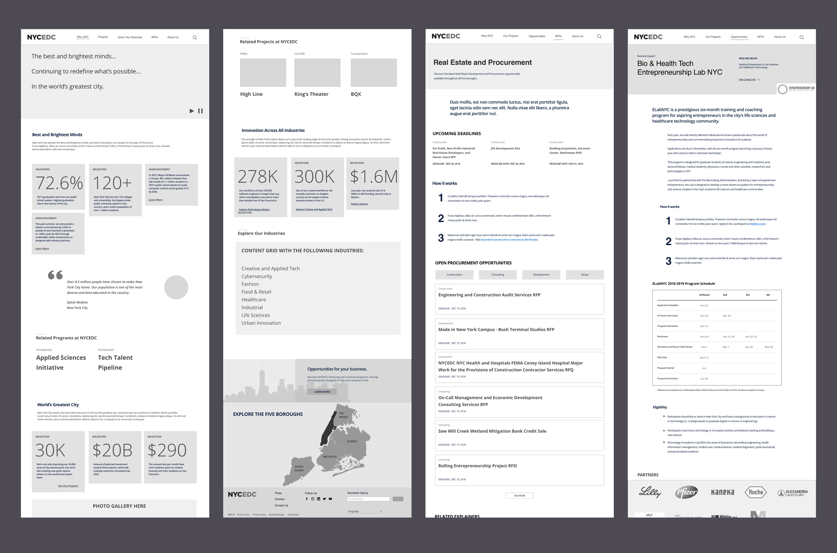
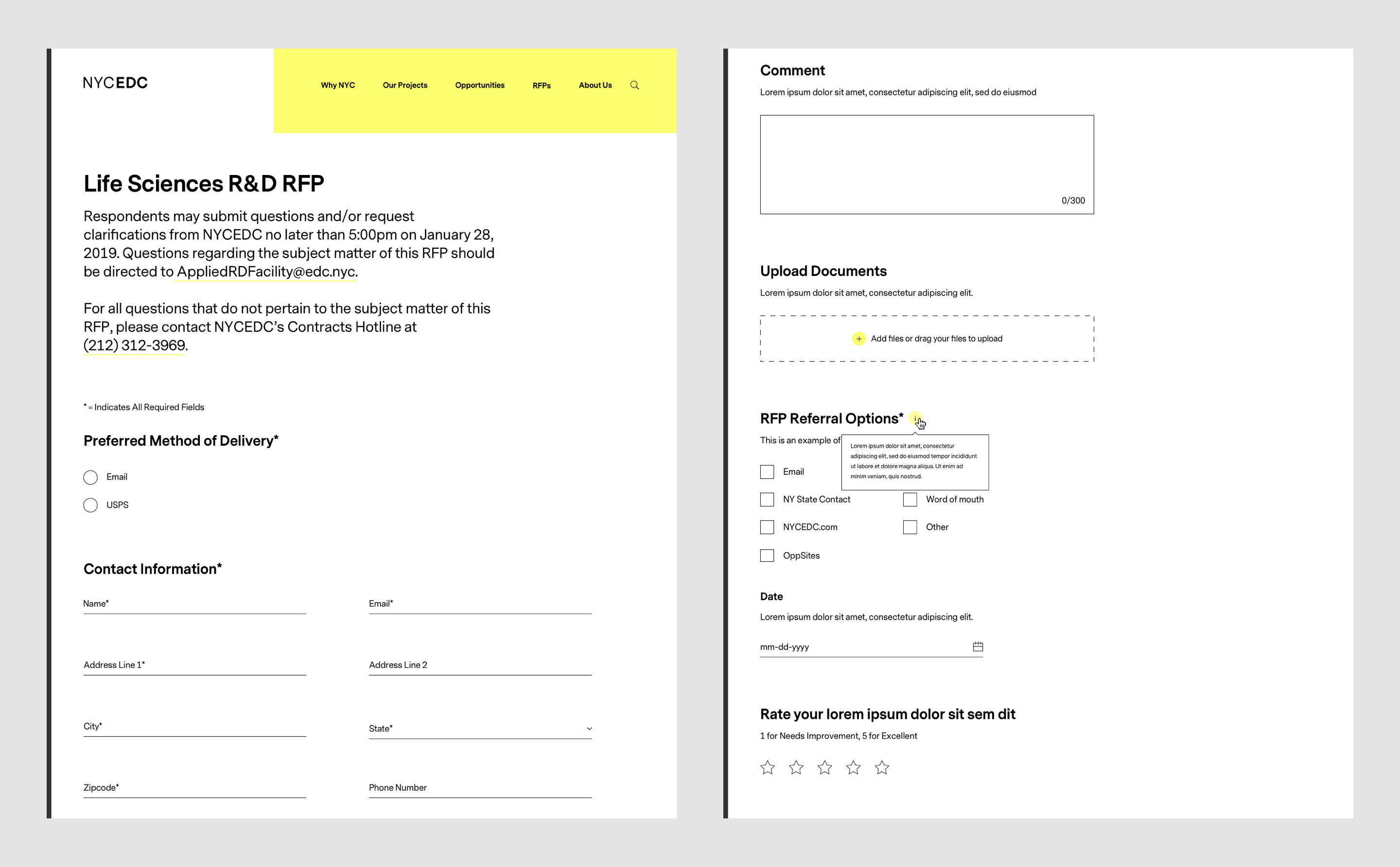
From Wireframes to Design
Iterated designs collaboratively with the team to produce the most optimized design solutions.
Interactive prototypes
Throughout the project, I designed more than 20 animated and interactive user interfaces to emphasize interactions and micro-interactions for the client, dev, and design teams. These prototypes help UX team detect usability problems and improve wires prior visual design phase. They also help dev team see if there are any technical/functional limitations.
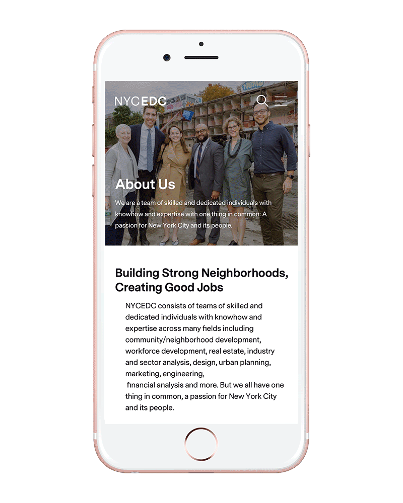
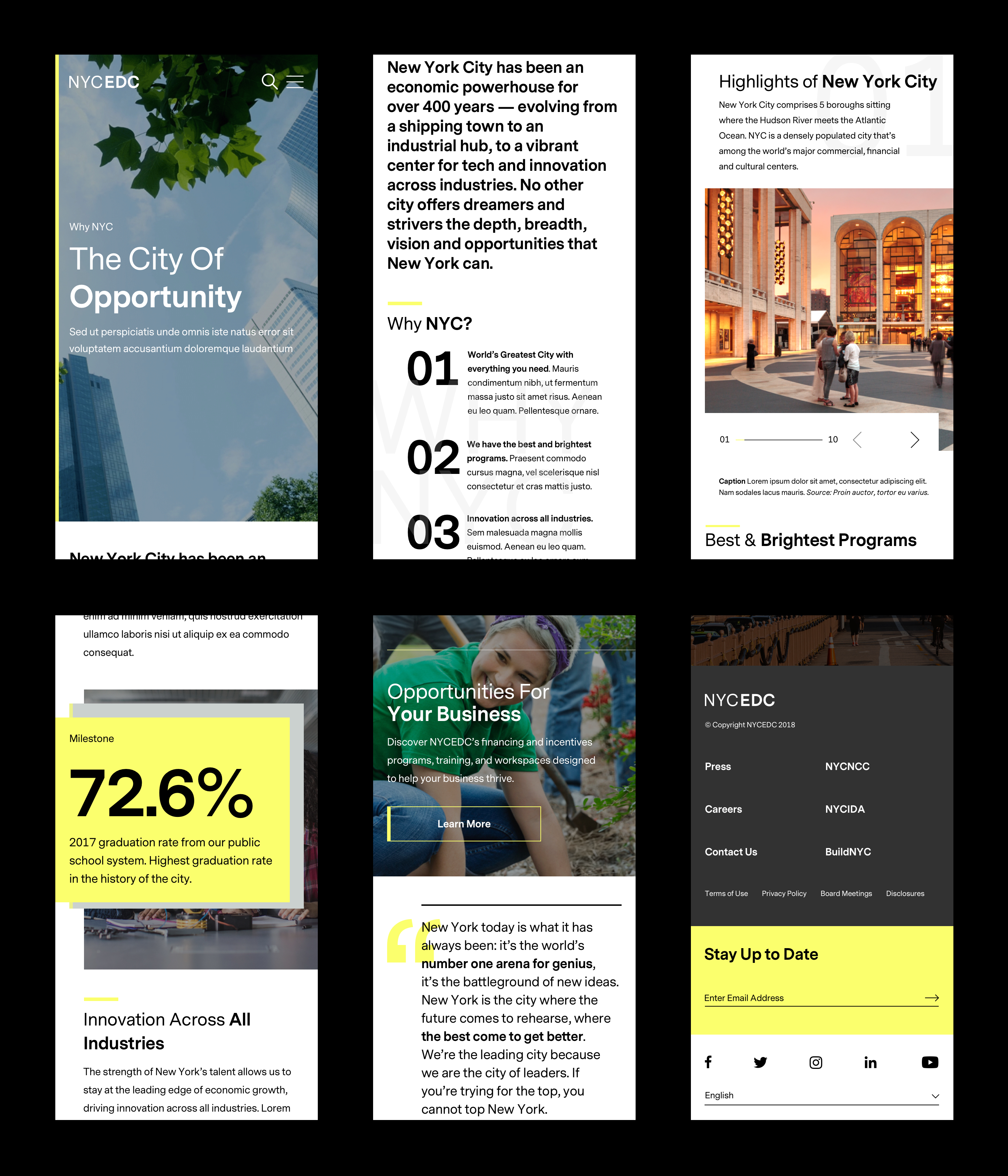
A Seamless Experience
Flexible modules and page templates are created to accommodate a variety of content types and branding customizations, and are accessible across devices, screen sizes, and capabilities.
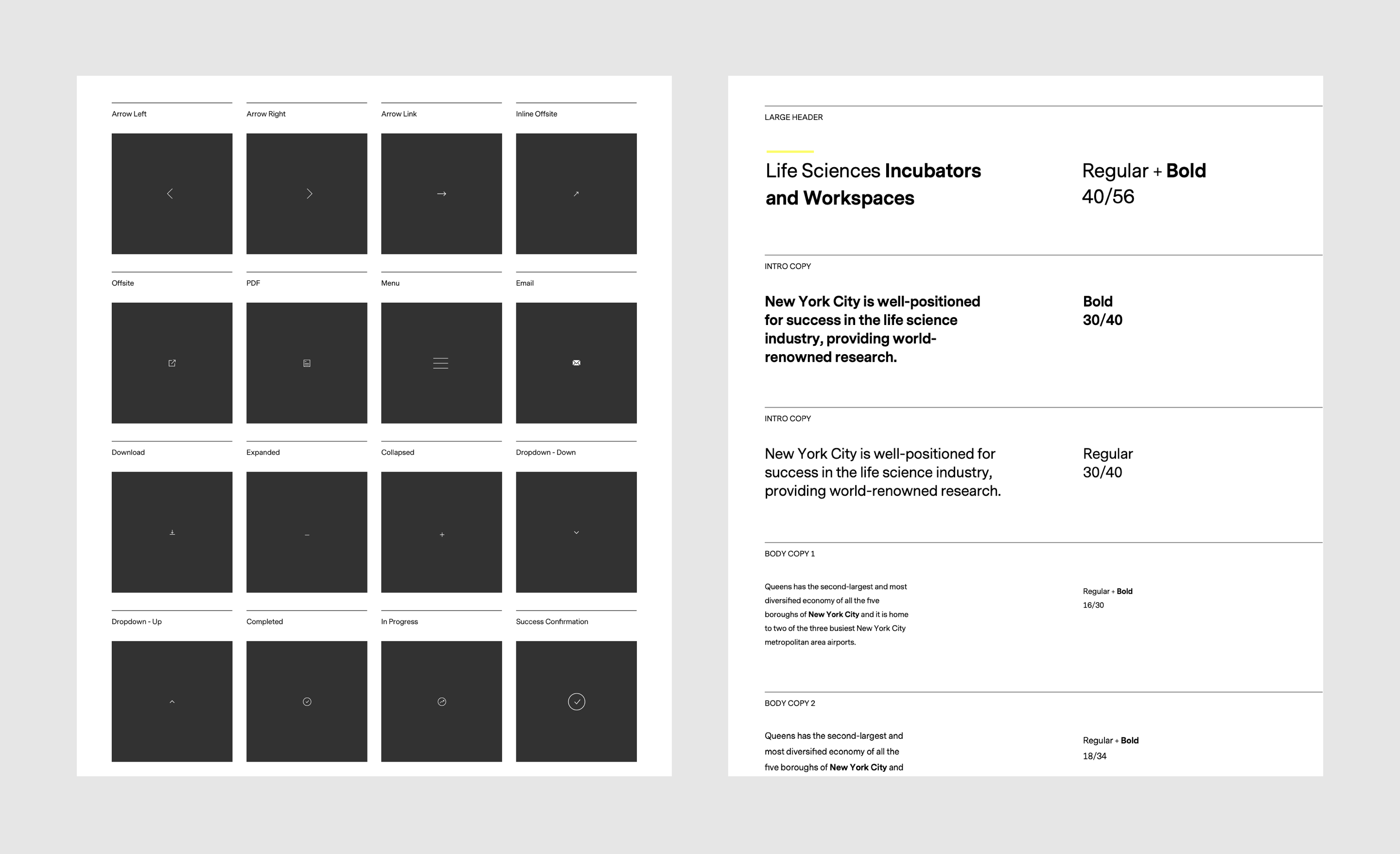
Icons and Typography
Clean and simple icons. San-serif font is used throughout to reflect the overall look and feel.