Dribbble App —
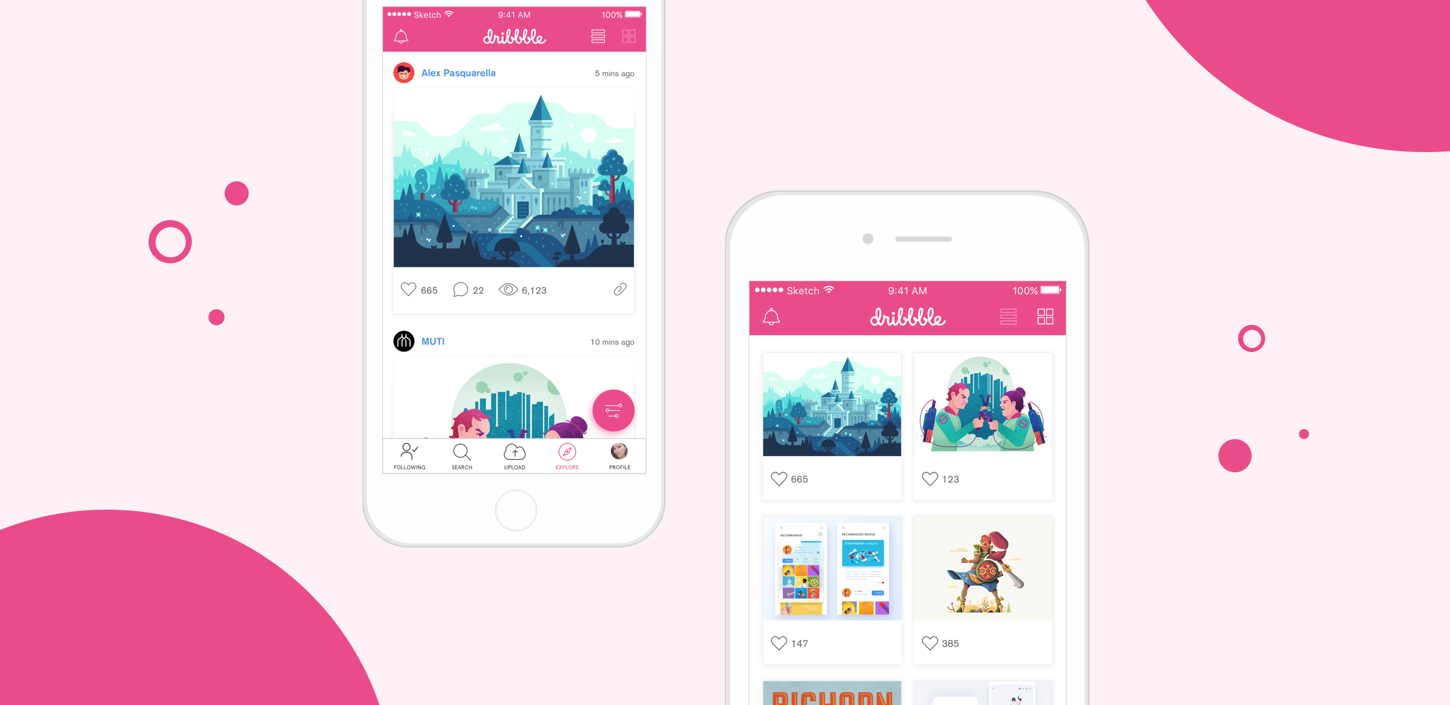
a needed Dribbble app made for Dribbble fans in 2016.
About The Project
In 2016, I dedicated more than three months to make the app Dribbble would deserve. Since my interests have always been in UX/UI design, this app design project was an opportunity for me to learn the principles of app design and really dig my teeth in user experience research.p>
Role
UX/UI
Visual Design
Agency/Year
2016
User Persona
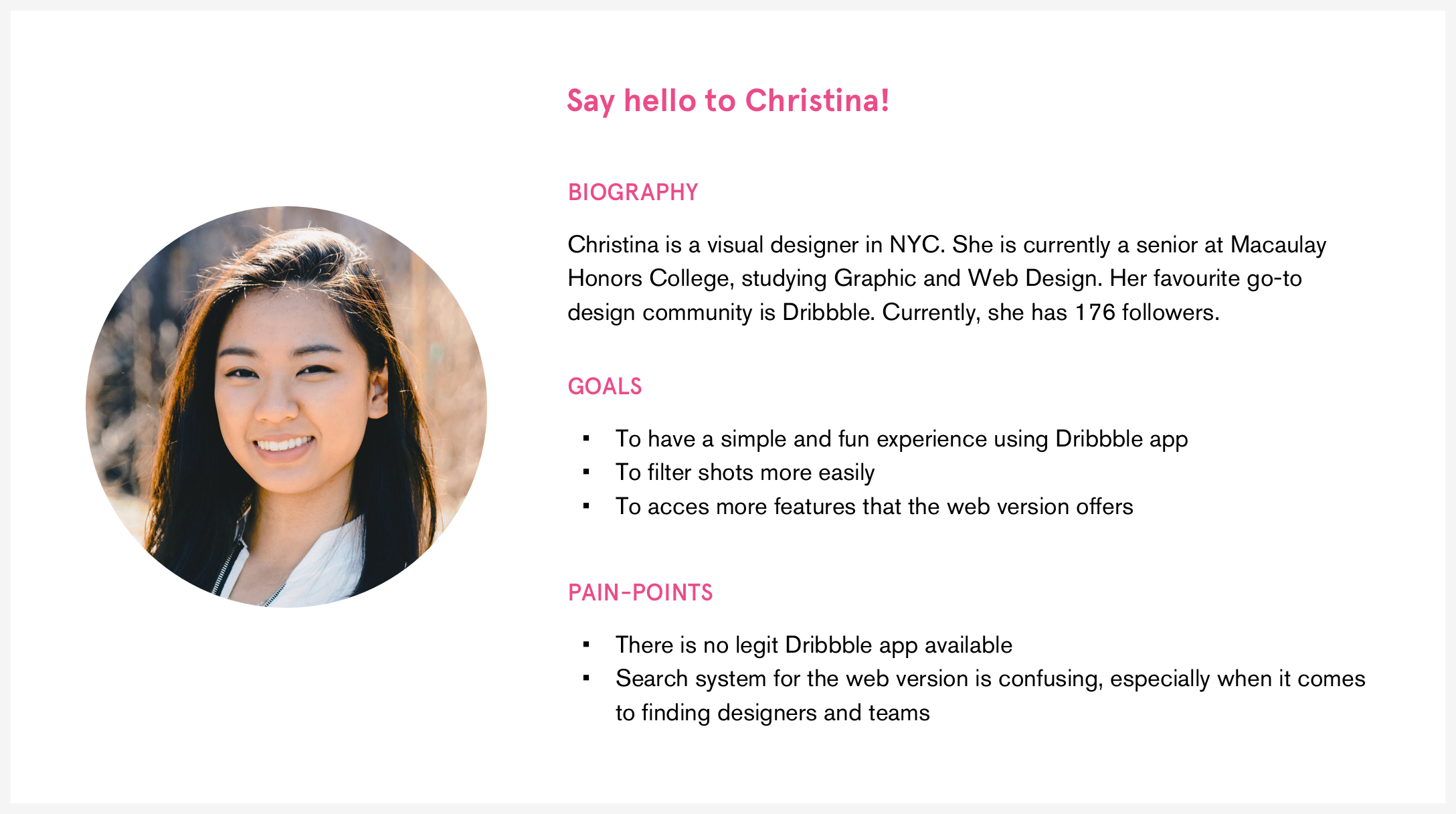
One of the essential steps of this project is building the user persona. With the information I gathered from research, I defined a persona to base my design decisions on. This allowed me to better understand the user's needs, goals, and behavioral patterns and set priorities for the design.
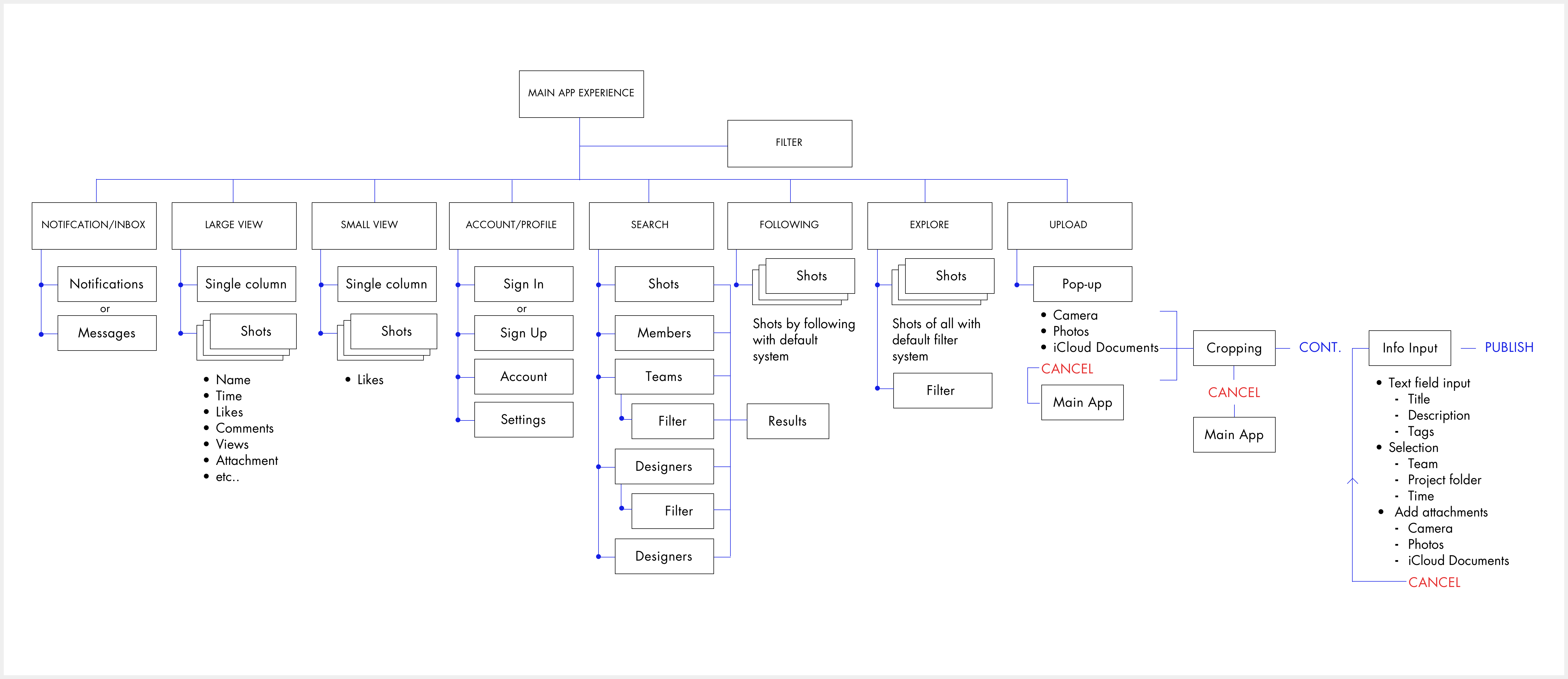
Sitemap
Wireframes
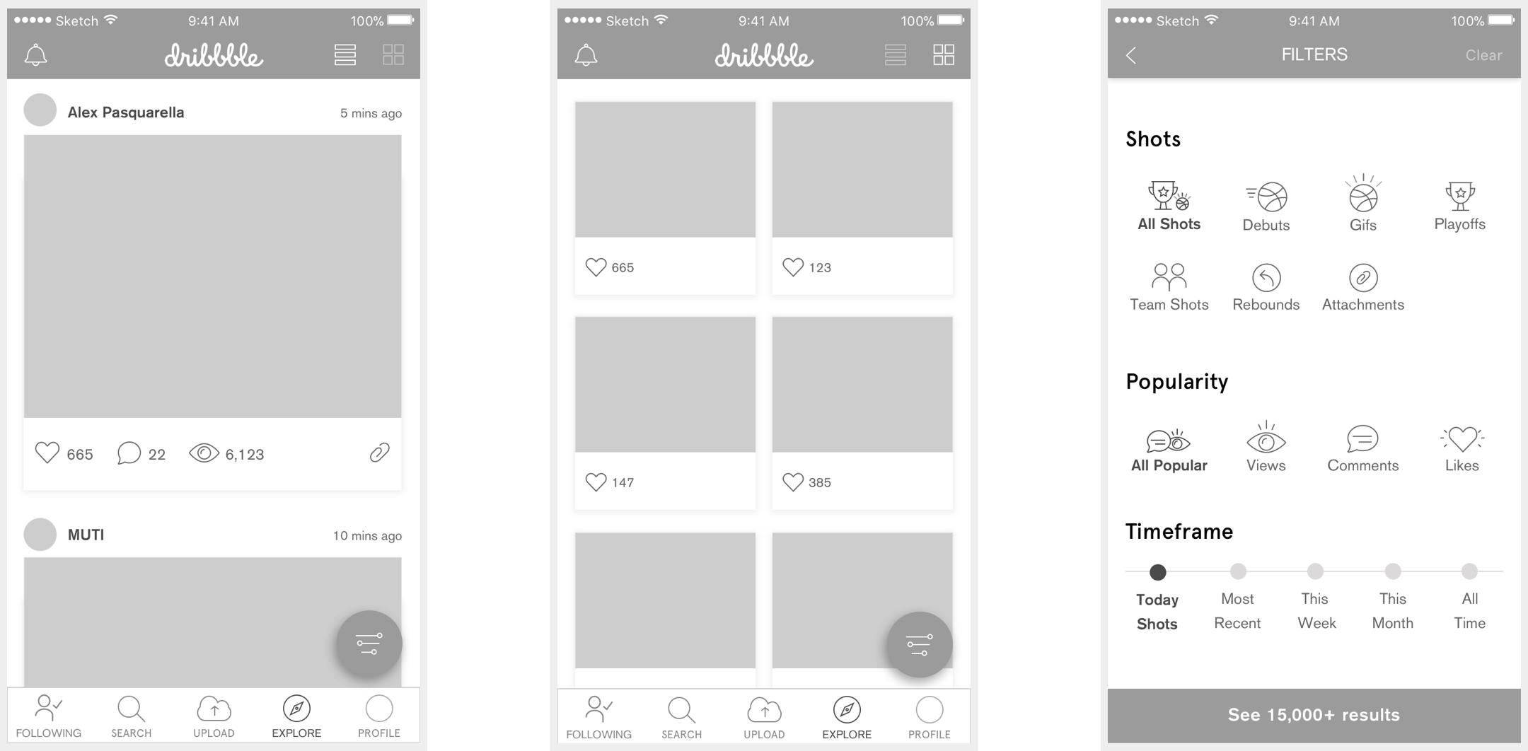
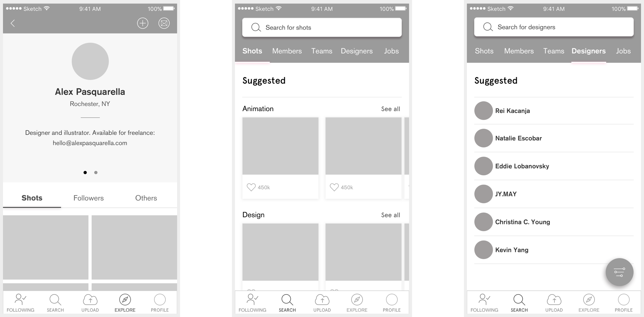
The goal was to create a simple, usable, and fun experience. After rounds of revision on the wires, I was able to prioritize the content and identify the limitations.
Small Details
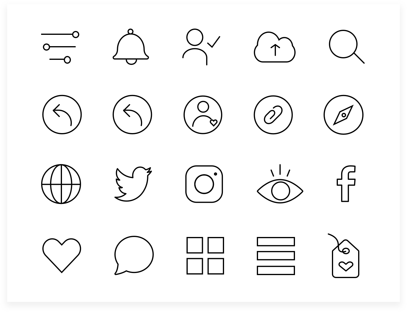
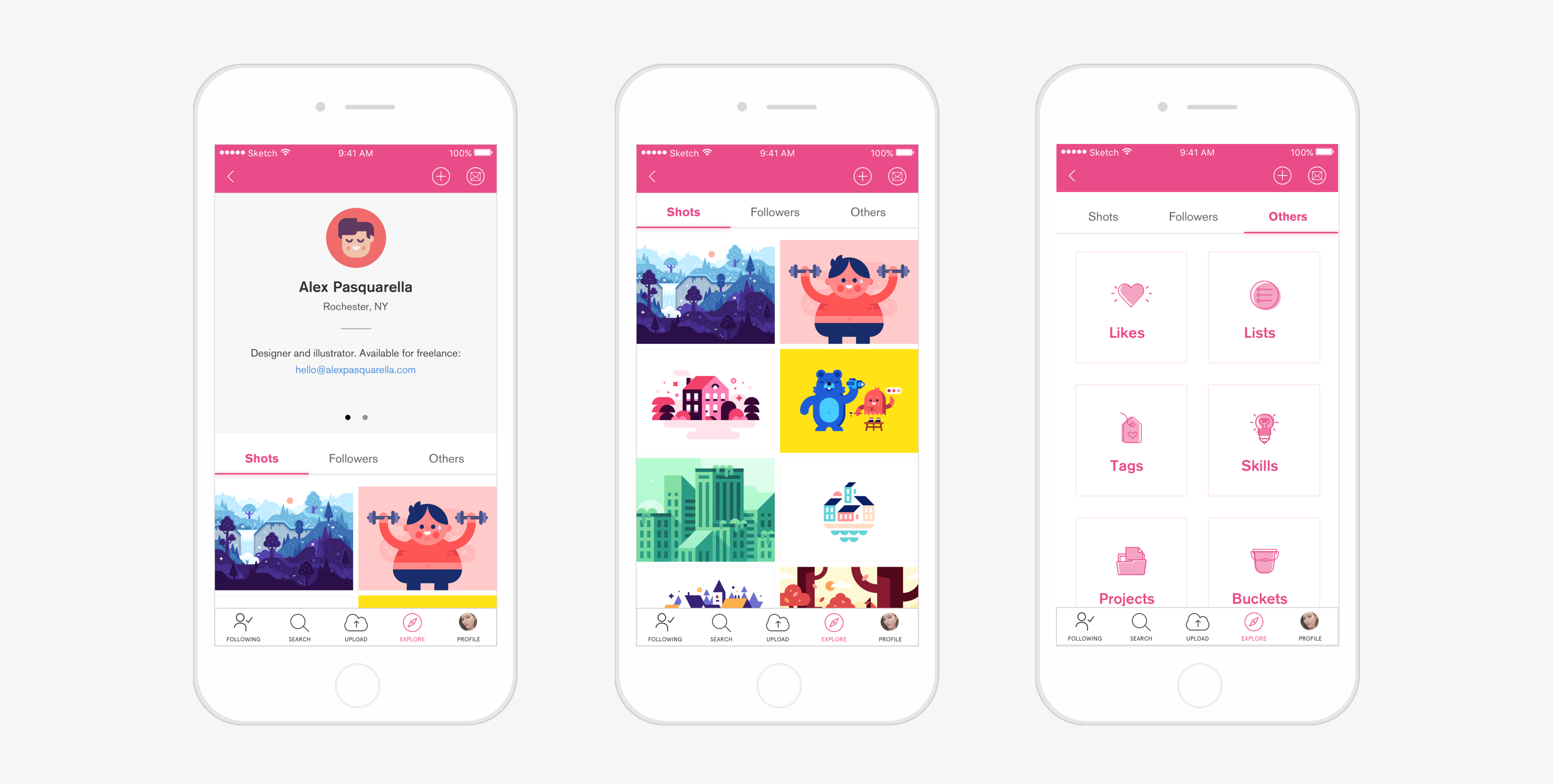
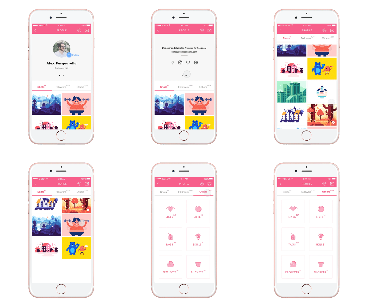
All the icons in this project are customized, adding a bit of fun and personality to the app.
Explore
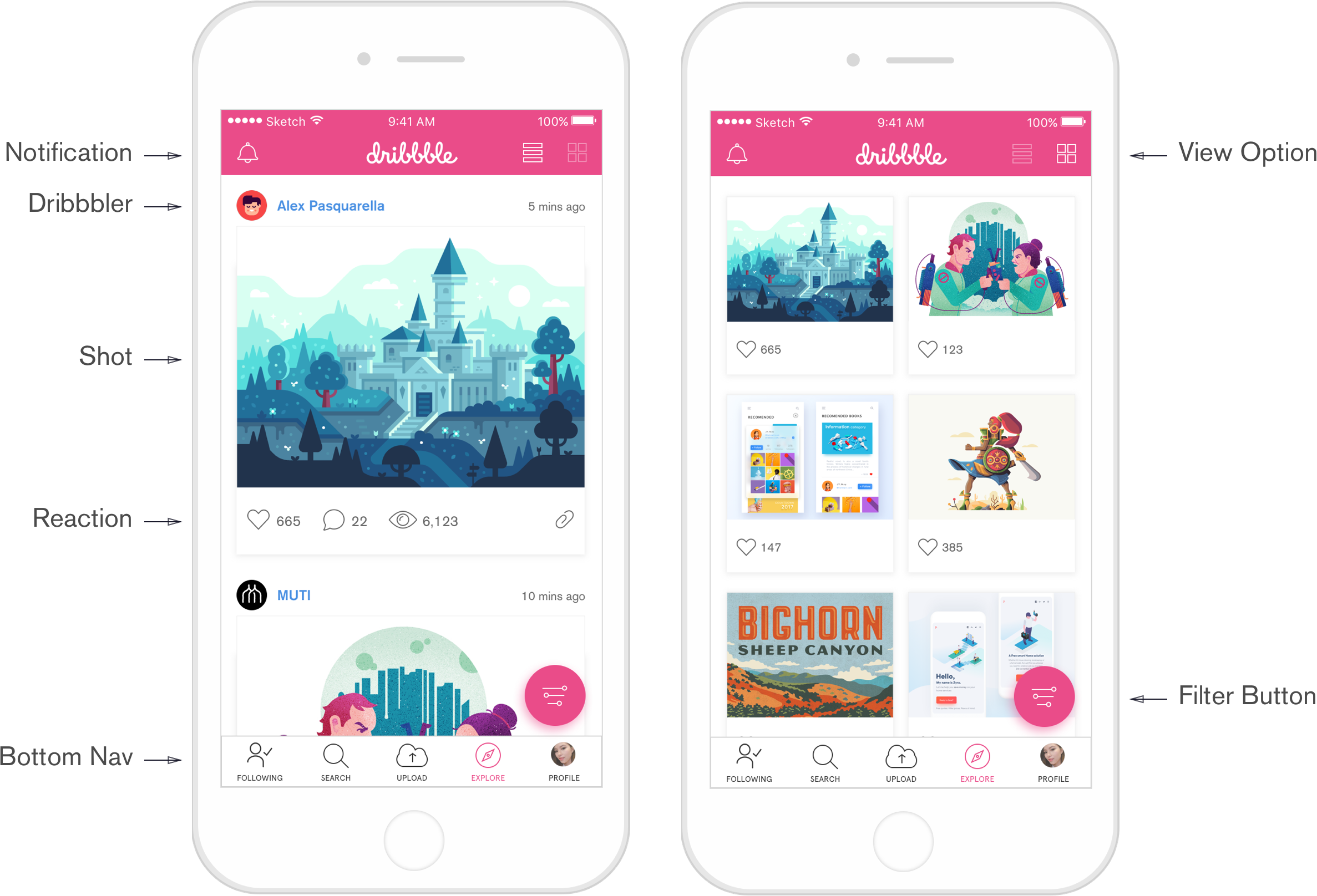
Under Explore, users can see the most recent shots, using default or applying a filter to refine their feed.
Search
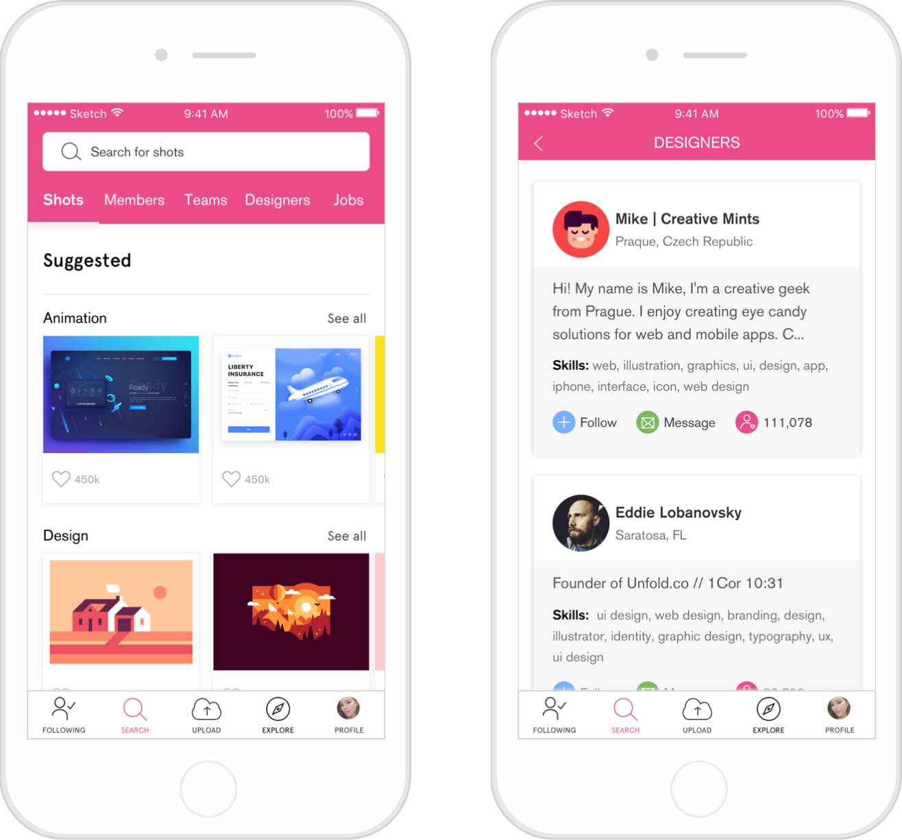
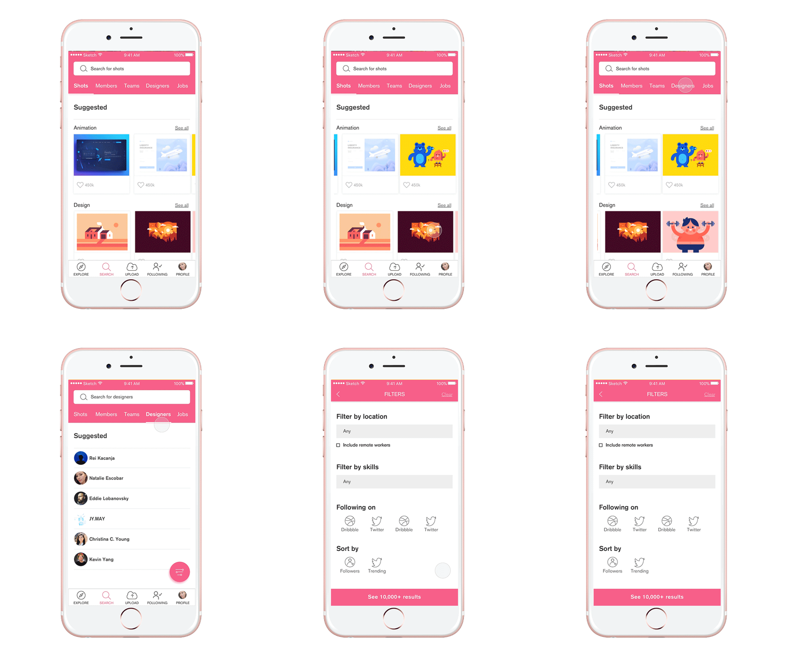
Using category tabs to narrow your search makes it easier for users to find what they are looking for. Suggestions are organized by most popular categories, designers, or shots. When users land on the Designers Tab, they can narrow down the list using the same filtering system.
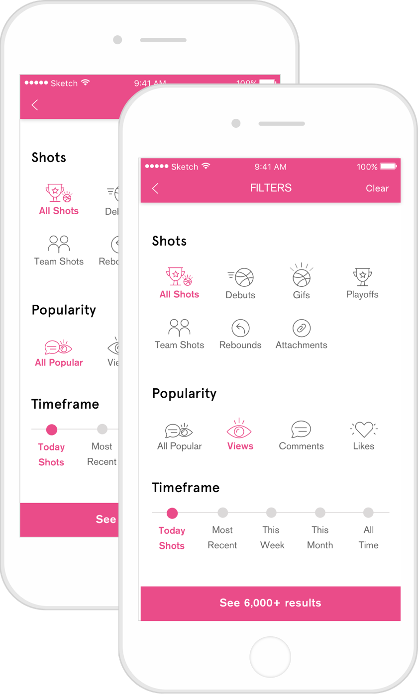
Filter System
After rounds of revision and testing, I ended up with a filter system that most users found to be easier and more intuitive to use as compared to the current one.
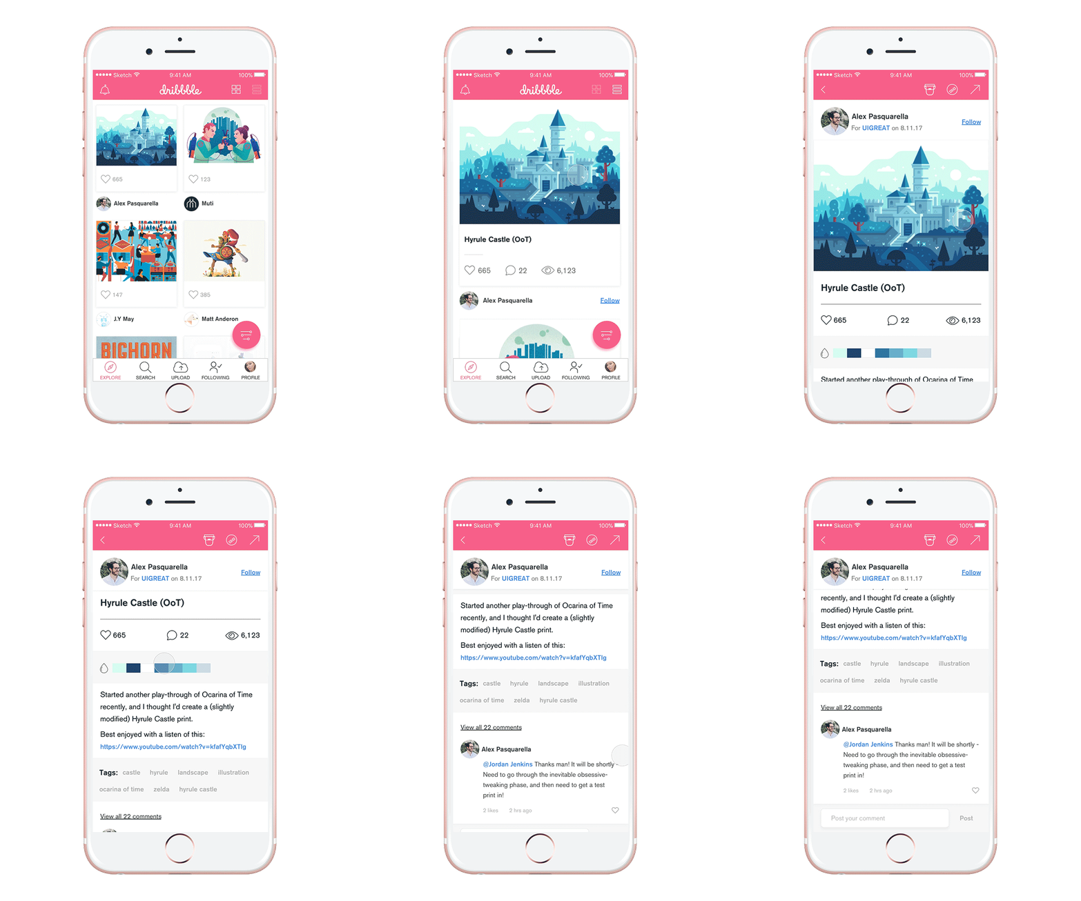
The Challenges
It was the first iOS app I worked on, so there were many things that I struggled with from prioritizing UI elements to creating a seamless roadmap. Another huge hurdle of this project was to find the right target survey group to conduct personas and ask them the right questions that would provide meaningful insights for the project.
Takeaways
This project definitely helped me learn more about the ins and outs of making an app, from empathizing with users to utilizing research and feedback from both users and designer friends to prioritizing features and eliminating redundant steps in user flows.