CCM Overview —
An overview page for Datadog Cloud Cost Management designed to help users better understand and navigate the product through customization and personalized data and insights.
Role
Strategy/UX Research/Branding/Prototyping/Design
Company/Year
Datadog/2022
Team
Front-end Eng: Jonathan Quach
Back-end Eng: Gui
Product Manager: Kayla Talor
Cross-team collaborators: Jenn Lebor & Karl Sluis
01. Project overview
What is CCM?
CCM is Cloud Cost Management — one of Datadog products that seamlessly unifies cost and observability data from across cloud infrastructure — easily scoped to teams and services — enabling primary users: engineers and FinOps practitioners to understand their total cost of ownership, proactively optimize their resources through automated recommendations, and gain deeper visibility into cost drivers.
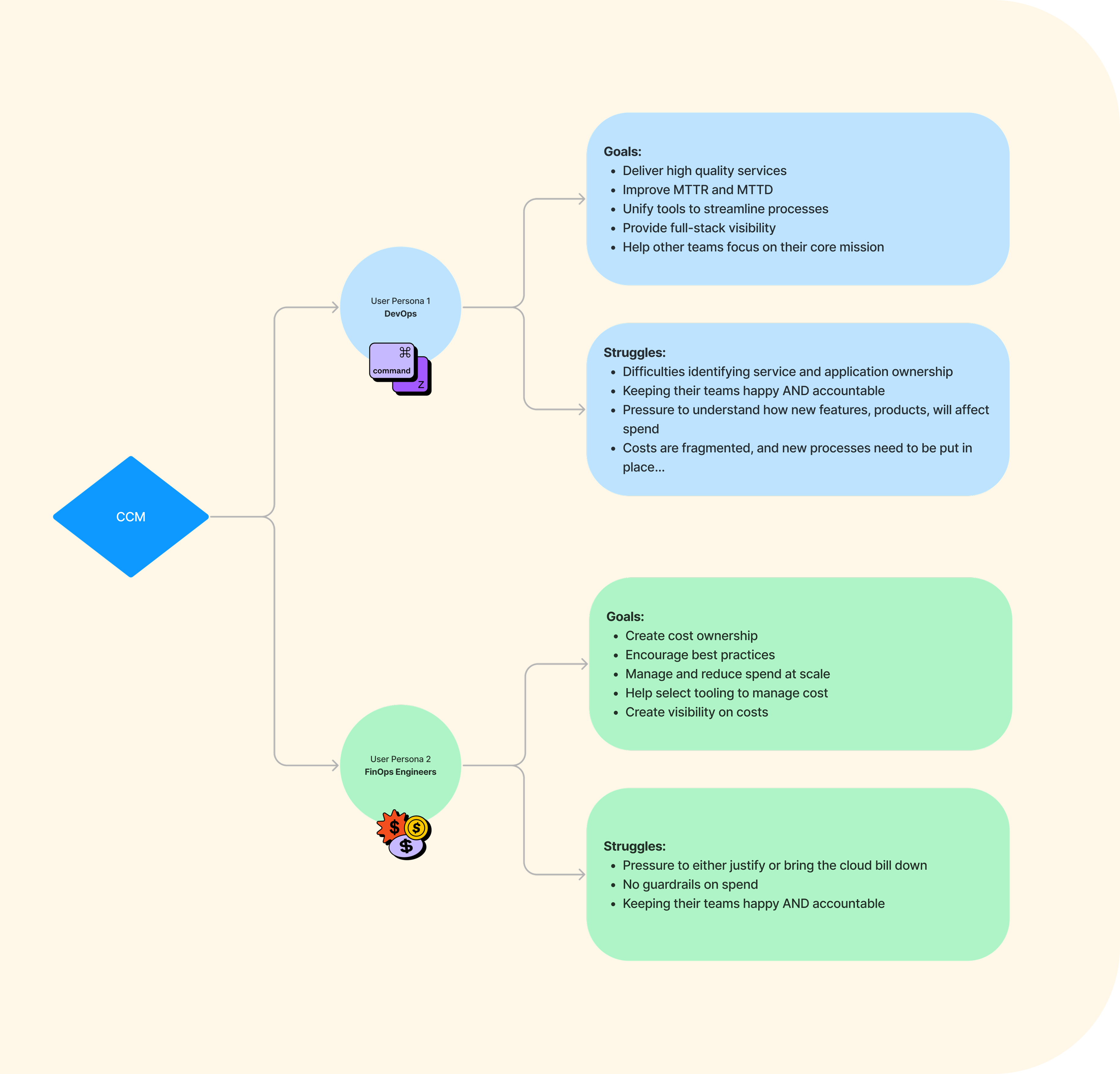
The Problems: Users problems
Cloud Cost users struggle to answer simple questions about their cost data using the Cloud Cost product, such as "What are my costs for my AWS accounts?" This is primarily because they do not know which tags to use to visualize their costs. As a result, they are unable to use the product to facilitate workflows in their organization to review costs with Engineering teams.
They expressed a desire to be able to do more with the page, such as drill into cost changes and why.
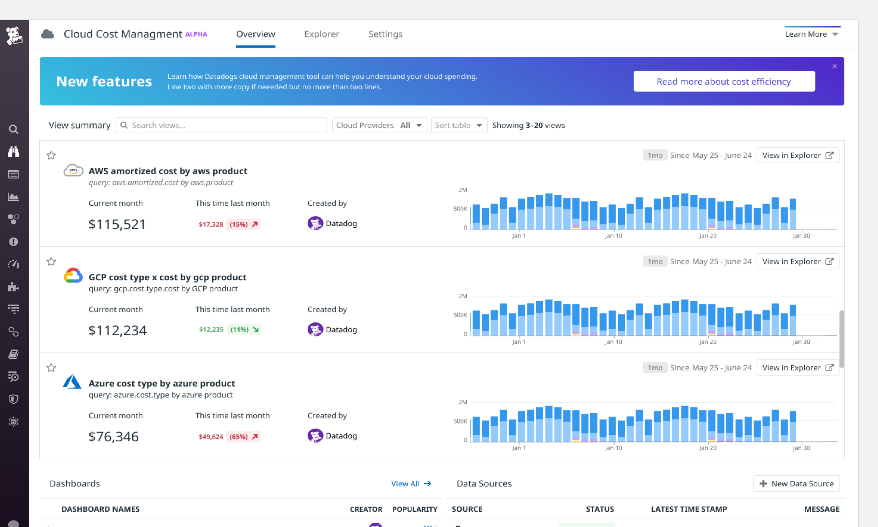
The Problems: Poor existing overview page performance
The CCM team introduced alpha overview page in May 2021. We consistently heard from users that the page was not useful with poor engagement while the data does not provide meaningul insights and help them understand the product values.
They expressed a desire to be able to do more with the page, such as drill into cost changes and why.
Goals
1) Help users understand how the product works by using their data + product personalization to tell a story and providing entry points for diving deeper.
2) Show overviews of a product 's use cases and benefits through our portrayal of the data being collected.
3) Help users answer questions like "What kind of data is in here? What can I do with it?", offering guidance for beginners while still providing value for seasoned users.
4) Achieve all of the above while addressing the problems specific to CCM users mentioned.
Proposed Solutions
We want to showcase not only overall cost data but also data for product/service/team specifically through the lens of comparisons and trends.
While helping users understand how to use the product better, we also want help them facilitate an optimized workflow by using other DD products.
02. Design Breakdowns
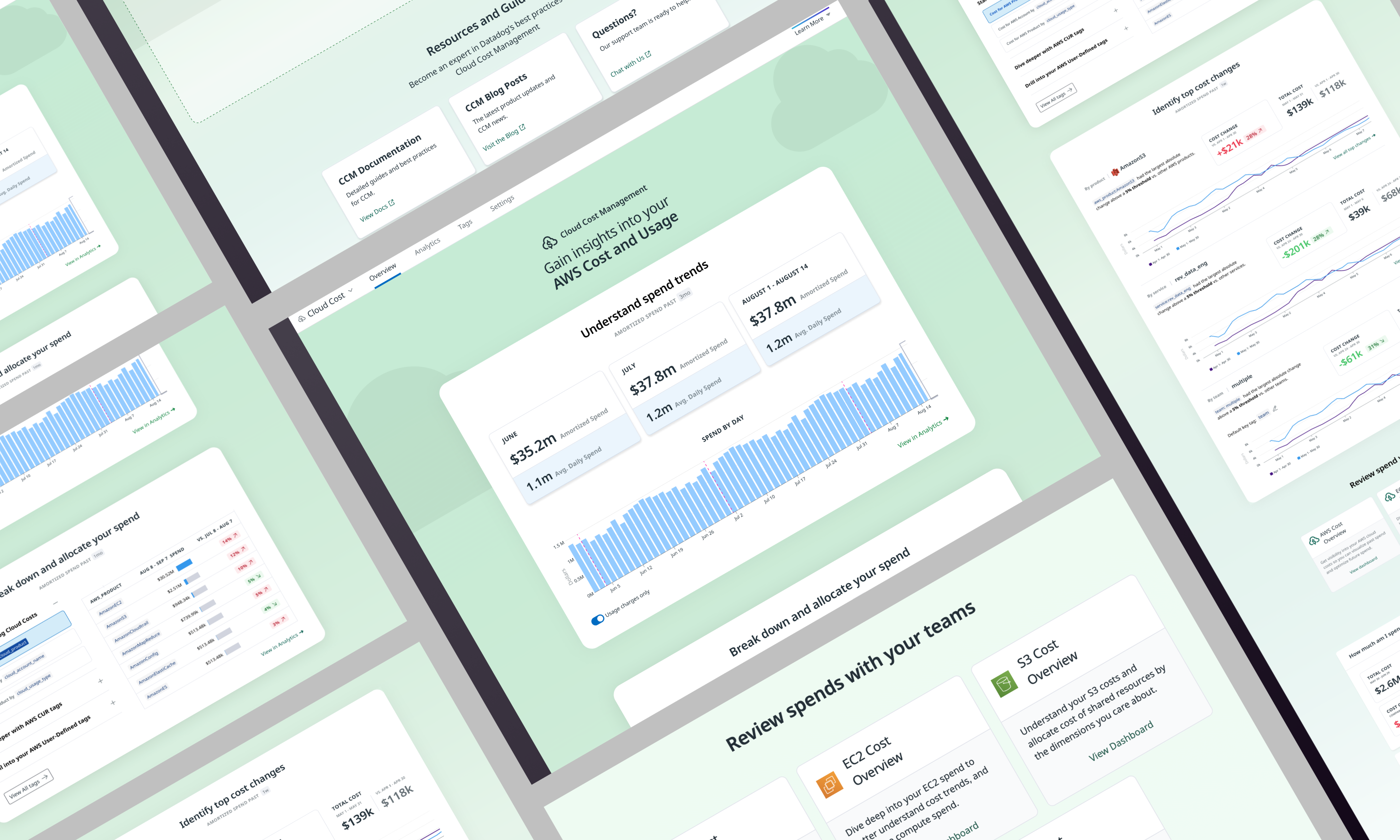
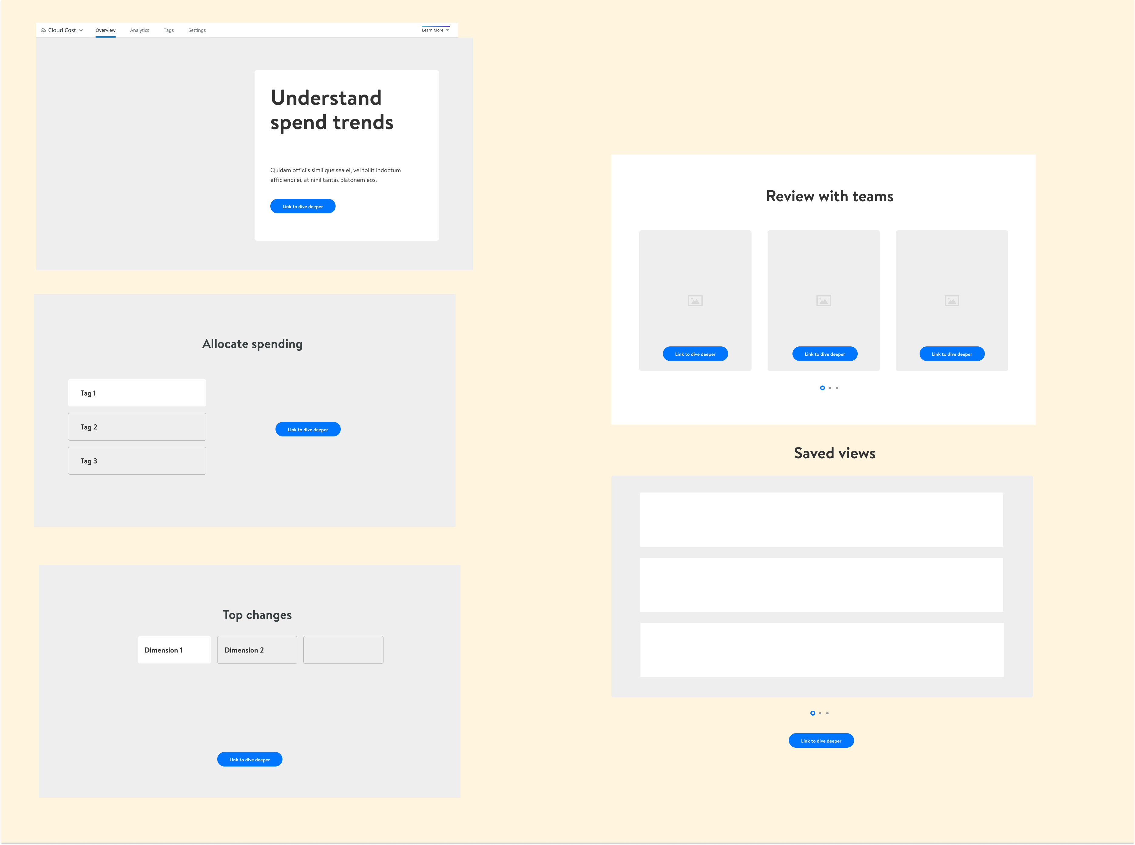
The design is broken down into 5 different parts:
1) Understand spend trends
2) Breakdown your costs
3) Identify top cost changes
4) Review cost with teams
5) View favorite cost reports
Understand spend trends
The goal of this section is to introduce CCM and what it 's used for. We start by repeating the product name as a headline on the page and pair it with metrics that show overall spend over a 3 month period.
Below the metrics section is a graph that shows cost change over the past 3 months. By default, the negative values are filtered out in this graph. Users have the option to include in the graph with the toggle below the graph.
Clicking on the "View in Analytics" takes users to the Analytics page for more information. Analytics page is where users search and investigate their cloud costs.

Breakdown your costs
We want to use this section to solve the biggest problem our users have struggled with using the product: Which tags should I use to get meaningful cost views? This section provides users guidance on which tags to use to visualize cost better.

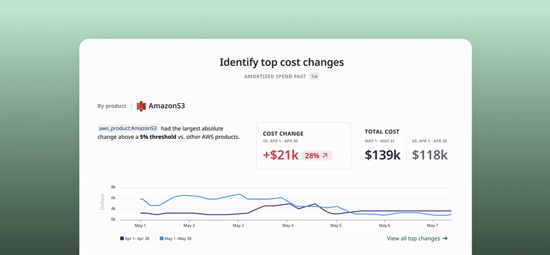
Identify top cost changes
This section aims to show users what changed most based on largest absolute change above a 5% threshold across 3 different groups that users care about: product, service and team.
For each view, we show a line graph that compares current month cost with last month cost.
Clicking the "View all top changes" button takes users to the Analytics page where can drill into top changes for other products/services/teams.
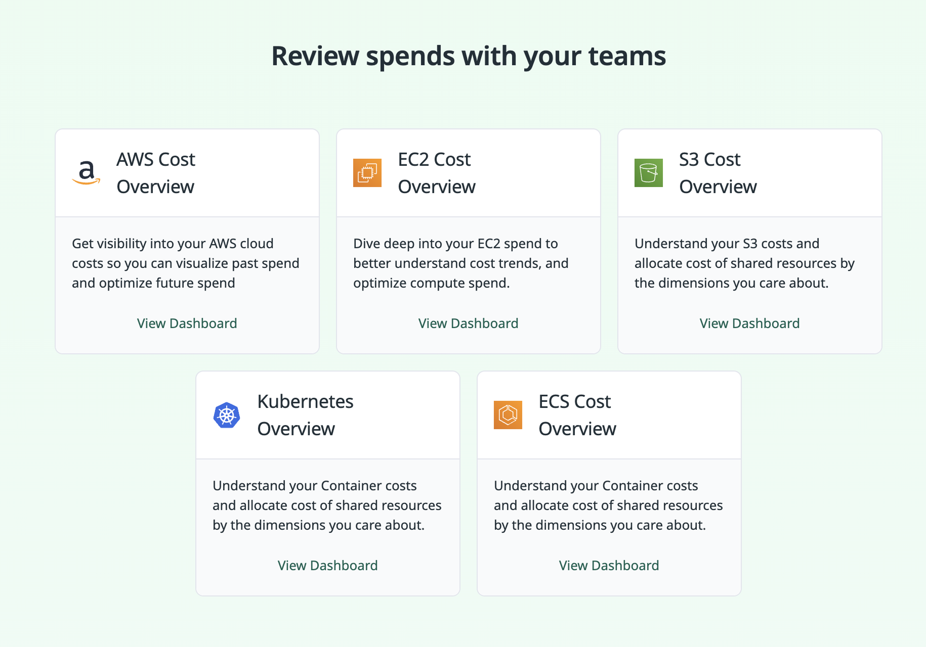
Review with teams
This section includes a set of predefined dashboards created by CCM to help users access the metrics they care most about and share them with Engineering teams. This section helps facilitate workflows with Dashboard product.
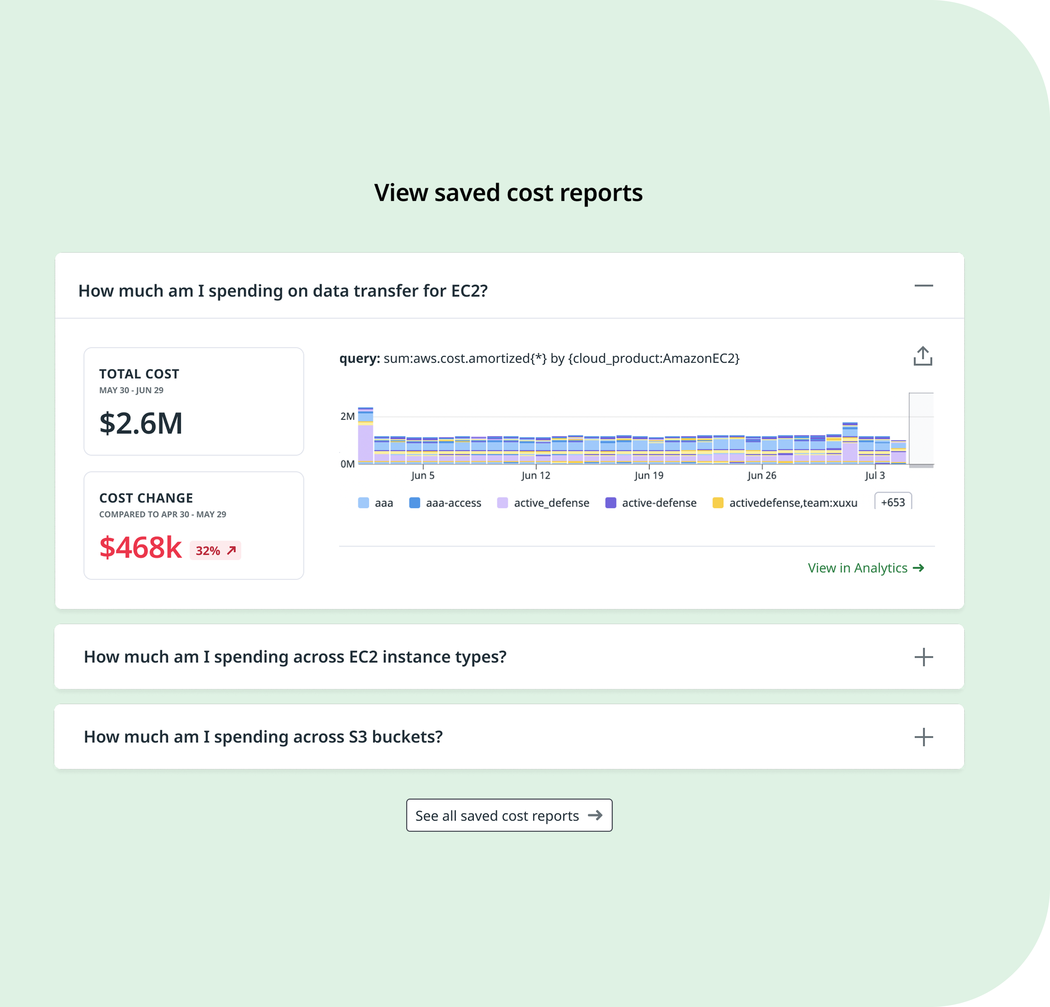
View saved cost reports
This section helps users get answers for their specific cost questions with predefined queries by CCM. We thought that framing the saved queries as questions could be a nice hook and help users decide which would be most of interest to them and guide them to shortcut to deeper analysis.
Clicking "See all saved cost reports" takes users to the Analytics page with the Saved Views panel opened. This also helps users discover where the Saved Views is on the Analytics page which users are not aware of when using the product.

Testings and Iterations
After several rounds of design iteration —driven by user testing and feedback from design, engineering, and even executive stakeholders including the CTO and CEO (who is highly engaged in the design process)&emdash; we refined the final version. One key piece of feedback was to replace the tabbed layout in the 'Top Cost Changes' section with a vertically scrolled view to improve visibility and reduce friction.
As I worked on enhancing other product features, the design was continuously updated to integrate those features into the overview page.

03. Results
04. Challenges